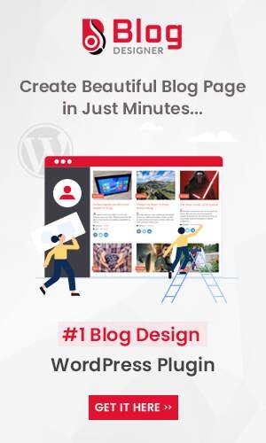
One sure way of inviting people to read your blog post is to have a fantastic website. While the content is very critical, you can chase away readers if you do not pay attention to the design. There are many themes and plugins, such as the WordPress blog design plugin, to beautify your blog. The main advantage of using some of these plugins is that you do not need any coding knowledge. The steps are easy to follow and definitely frees you from having to hire a web designer to do the job for you.
In our article below, we will share with you tips and tricks on how to beautify a blog. It will especially be beneficial to anyone who is hosting their website on the WordPress platform. It, however, does not mean that you cannot use the tips even when hosting your site on other web builders.
1. Think About Your Theme

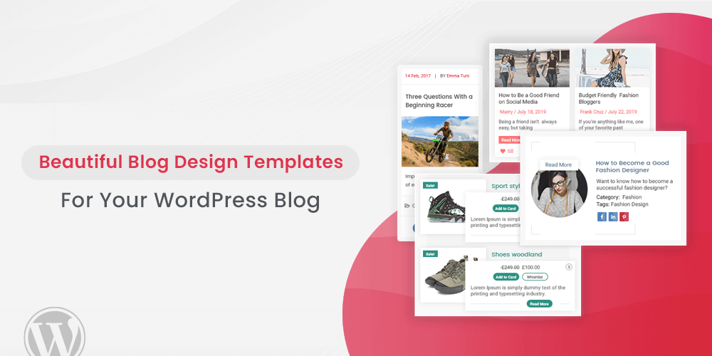
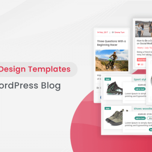
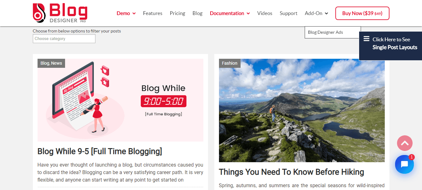
The first step to beautifying your blog is to pick the right theme. Platforms such as WordPress have excellent themes and plugins that you can use to create your website. Plugins like the blog designer our easy-to-use and give you tons of designs and templates to choose from. You can go with the free option or the paid version that has more features and benefits. The right template will have everything you need, such as color schemes, fonts, and layout ideas.
2. Presentation Matters
Imagine finding yourself on a website where there does not seem to be any kind of order. Everything seems hastily put together. Eventually, you feel like the designer was just throwing stuff onto the page. On a scale of 1 to 10, the possibility of you staying on the website will possibly be zero.
Why then would you want to take your audiences through such an experience? The presentation on the website will depend on the template you choose. You should also organize your information in a way that makes it easy to digest and Scannable.
The use of things like bullet points, numbering systems, headings, and subheadings will be of big help. Use the H1 H2, H3 subheadings to break your text into bite-size chunks.
3. Paragraphs
Breaking your paragraphs into smaller sizes will make the material easier to read. Line spacing between the paragraphs gives the illusion of rest or a break, especially when you have a lot of content. If there some specific points you want to bring your readers attention to, use the italics or bold functionalities. However, be careful not to litter the content with too many of them. It can end up looking like you did not pay attention to the overall formatting.
Using grids or columns can also make your content look more digestible. It is easier for the eyes to run up and down than from side to side. The blog design plugin, for example, allows you to set from 1 to 6 grid columns depending on your preference.

4. Sentence Length
It can be easy to go content crazy when writing. You find that you’re writing very long sentences. Yet, the truth is, shorter sentences are easier to read. The longer they are, the more tedious they can get to read. Focus on keeping the sentence length to about 100 characters. It makes information easier to digest. Most importantly, your audiences don’t have to struggle with remembering where they were when reading.
5. Avoid Grammatical Errors
Imagine looking for information, and you land on a website that you think has all the information you need. You eagerly open the relevant post, but before long, you find that you cannot go on reading. There are so many grammatical errors, and the sentences have no flow. You start to wonder whether the owner of the website took the time to go through the contents. How can you even trust the authenticity of such material?
Needless to say, it is very unlikely that you will continue on that particular site. You must pay attention to proofreading any content before you put it up. There are so many online tools you can use at no cost, to rid your work of grammatical errors. You may think it is time-consuming, but not taking this step could result in you losing important traffic on your website.
6. Use of Quotes
The use of quotes shows that you took the time to do your research. It lends weight and credibility to your blog post. You have the option of the block and pull quotes to use in your articles. The former will provide support for the article. The pull-quotes are lines you would want to stand out from your article. Attribute the quote to the relevant source to avoid cases of plagiarism.
Useful Read: Ignore Blogging Blarney: How To Get Awesome Blog Results
7. Think About Your Font
You have probably been to some websites, and you wonder why the designer chose that particular font. You find that it is unattractive to look at, and reading the content is very difficult. The font size is so tiny that you find that you have to magnify the page to read. It is a mistake that you should avoid because content alone is not enough to draw in your audiences.
When you pick on a particular font for your blog post, put yourself in the audience’s shoes. Think about your readers. If, for example, your target is older demographics, why would you want to put them through the strain of small font sizes? Experts say you should use the pixel size 14 to 16. It, however, depends on the style. Size 14 on one may be fine with one style, but huge on another. You will, for example, find a marked difference between Calibri12 and Trebuchet 12.
If possible, get feedback from people you trust to give you honest advice and recommendations. Also, take a minute to look at what other people are doing on their website. Pay close attention to your competitors and see the style and size of the text they are using. You do not want to lose your audiences, only to have them trooping to sites with content similar to yours. Once they leave, it will be hard to get them back.
Focus on other aspects of typography, such as the color of your website and how it relates to the overall brand messaging you have. You want to remain memorable while communicating whatever it is you need to.
8. Avoid Over-Stylish Fonts
Some people make the mistake of choosing very stylish fonts. They may look attractive, but may not be the easiest to read. Unless you are designing cards such as wedding invitations, stick to more legible fonts. Good options include Calibri, Georgia, and Arial. Once again, it pays to know exactly who you’re trying to communicate with. The younger people may gravitate to slightly more stylish fonts, than say, Arial. You can, therefore, opt for another font that you know will attract them, without losing the legibility factor.
9. Font Color Vs. Background
The best advice you will get from anyone is to make sure that your font stands out. Do not go wild with the colors and choose those that will fade into the white background. Imagine trying to read this whole article, with a light grey font. We can bet that in less than 2 minutes, your eyes will be straining. Within three minutes, you will probably have given up and moved on to another website.
Stick to black or very dark grey when choosing your font color. Only change if you have made changes to the background color.
10. Justifying
You have three options when justifying your copy. You could either choose the left, right, or center. Think about what content you are presenting, and then think about how you will justify it. Poems, for example, look very nice when you center align them. Captions or catchy phrases will also look great in the center position. However, for longer blog articles, stick to aligning to the left. It makes it easier to read and helps readers avoid eye fatigue.
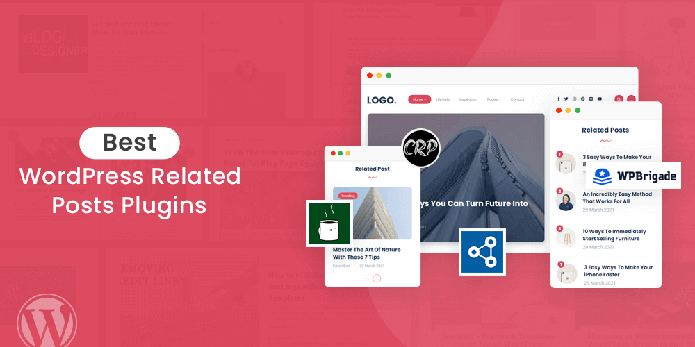
11. Use of High-Quality Images
Photos and images have an integral role to play in the overall look and design of a website. Human beings are visual creatures and will generally gravitate towards attractive images. Pay attention to the quality of the images. Blend it in well with your content.
Do not use images without permission to do so. You could find yourself in a lot of problems with the owners of the images. You could even find yourself facing a lawsuit from the aggrieved parties. If you have a website, consider it a worthwhile investment to take your own photographs.
Unless you have the qualifications or knowledge, hire a photographer to take professional images. Beautiful images will draw in audiences. Make sure they are of high quality and have relevance to the type of quality content you have on your blog posts. Maintain consistency and a smooth floor with regards to the images and videos you use.
Your other option is to invite audiences to share pictures that you can use on your website. User-generated content is a fantastic way to collect images. It also makes the contributors get a sense of ownership with your content. Do have it is part of your terms and conditions that you will use the images on your website.
Take time to learn to use tools such as Photoshop so that you can tweak your photographs appropriately.
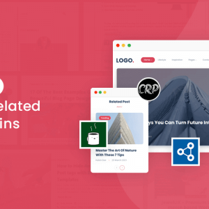
12. Featured Images
One sure way of attracting attention to your website and blog post is to use featured images. A featured image refers to that one image that you will have right underneath the title of your post, like the one we have above. It will attract the attention of anyone who happens upon the post. It will also show prominently when you share the content on your social media platforms. The key is to use a unique image that is relevant to your content.
13. High-Quality Videos
Every time you are searching for information, especially tutorials, do you find yourself gravitating towards YouTube? If yes, there is a good reason; video content is easy to digest. Embedding the video within the text makes it more likely that someone will click on it. It beats having to read lines and lines of text to understand something.
Think about incorporating the use of videos in your blog posts. They are interactive and allow you to share so much more information than you would with written information. Make sure you’re engaging and that the footage is of high quality. Also, check that the sound quality is excellent because no one will strain to hear what you have to say. Be consistent in your delivery and the number of times you post new content. You will attract more traffic to your website through the use of video content.

14. Image Sizes
You may think that it is not a big deal to focus on the size of the images, as long as they are of high quality. You could not be further from the truth. Pay attention to the sizing and maintain consistency throughout. Try and keep them the same size; a good guideline will be to stick to 800 pixels and above. Such images will automatically adjust to the size of the page.
Not paying attention to the proportions may interfere with the design of the page. You have the option of using various online measuring tools to measure the sizes. You can then adjust them appropriately by cropping or resizing.
15. Invest In Hiring a Designer
Plugins such as Blog Designer from WordPress our easy-to-use, and you do not need any coding knowledge. For beginners, you can use the templates available to come up with a design for your blog pages. You will find step-by-step tutorials that teach you how to do it well. However, the more your website grows, the more you should consider investing in hiring a web designer for a professional look.
They have the knowledge and expertise to polish up any areas that may be lacking. You will also gain a lot of insights from the advice they will give you. It will cost you money, but, the more traffic you have to your website, the higher your chances of making the money back. High-traffic websites can monetize and give very good returns in the long run.
16. Think About Embedding Quality Content
You can increase the interaction on your website and beautify it by embedding relevant content to your blogs. Twitter is a good example because it allows you to embed tweets thus making them appear on your posts. With more interaction comes greater interest which will lead to a growth in organic traffic.
17. Keep It Simple
Think about your website much like you would, when doing the interior decor of your house. The more stuff you put in, the more confusion you create. The simpler the design, the more attractive it is. The same applies to when you are designing your website.
You may be under the mistaken assumption that the more the better for your website. You end up putting irrelevant things in your headers, footers, and sidebars. You also take so many ads in an effort to make money. Even if you have many ads, know where to place them. You can place some of them in the archives or categories.
Not paying attention will result in you bombarding your audiences with promotions and information every time they log in. Web designers will tell you that some of the best templates are those that keep things very simple. Ensure you have a call to action, and that your pages are easy to navigate. Do not ignore the importance of links that work and how fast the pages load.
18. The Menu
Simplicity should be a running theme when designing a website. Your menu, for example, should have very few items on it. It makes it easier to navigate and will be aesthetically more pleasing to look at. Dropdown menus are excellent for when you have a lot of categories. Other website owners incorporate the use of double menus.
One menu will have information about the main pages. The other will contain information on the different categories you have for your blog posts. It allows your audiences to go directly to what they are looking for. It also helps improve the appearance of your website.
19. Be Careful About Your Ad Choices
We have already looked at some of the things you need to do when putting ads on your website. It is also important that you are very choosy about the kind of content you allow on your website. You can bring the reputation of your site to doubt with the kind of ads you run. Some of them look cheap, while others could damage your reputation. Go for those that fit into your content, so that you do not leave your audiences wondering why you choose to advertise certain things.
20. Sidebar Information
Avoid clutter on your sidebar by minimizing what you put on it. Some people opt for blog rolls on the sidebar. Whether it is a good thing to have or not is really up to the individual. They will take up space but they have their own benefits as well. One good tip will be to avoid having long lists. Instead, focus on single posts that you can link to the sidebar.

Have a good plan for what you want your sidebar to do for your site. It is an excellent place to connect social media pages. It does not, however, mean that you distract people with large icons. Depending on the platform and plugins you opt for, you will find widgets that are functional yet attractive to look at.
21. Take a Critical Look At Your Design
It is easy to develop situational blindness when you’re designing your own website. You may think that design is the best. However, what you could be having on your website are outdated templates that no one uses anymore. You could also have images that have no relevance to the content. You can add timeline design to showcase life story, hiring process, company story, event summary timeline, etc. Once again let other people give you feedback, and work with professionals for a more polished look. Be ready to take the feedback you get without feeling you are under attack.
22. Optimize Your Website for Mobile Devices
If you are operating on an online platform, you cannot ignore the importance of mobile traffic. Industry estimates show that the number of mobile users is more than those who use desktop appliances. More than 55% of internet traffic comes from mobile devices. You must, therefore, pay attention to how your website looks on such appliances.
Experts actually recommend that you design your website for mobile, and then tweak it for desktop appliances. With so much internet traffic from mobile, it only makes sense to optimize your platform for them. Make sure the design adapts to the size of the different mobile devices including phones and tablets.
Take advantage of tools such as Google’s mobile-friendly test to see how your site looks on mobile devices. Remember, platforms such as Google will penalize you if you do not optimize your website for mobile. Your rankings in the search engines will be very low. You will not be able to grow your organic community and will not have the traffic you need.
Also Read: From Blog Into A Brand: How To Take Your Blog To The Next Level
Final Thoughts
Setting up a website is just the first step. It starts with understanding your target audience and what they may like or not. You should then take the time to customize and beautify your blog pages depending on this understanding. The blog designer plugin from WordPress will simplify the process for you.
You get tons of templates that you can easily customize into an attractive website. Pay attention to other factors, such as the use of high-quality images and videos. Also, consider the font size, style, and color. Remember that you should optimize your sites for mobile. You will get the opportunity to attract a large number of internet users who use such devices. You will also enjoy better rankings on the search engines.